
Player Controls Framework
You can add custom buttons, dialogs, and other behavior to the Wistia player.
What is a Player Control?
When we use the term "Player Controls," we're talking about the different elements over a video that you can interact with. For example, the thumbnail, big play button, playbar, and context menu are all player controls, and their behavior and styles are all defined using the Player Controls Framework described in this document.
Every player control has a "type" attribute which governs where and how it renders. Each "type" may have 0 or more controls. It's up to Wistia how they are displayed. For example, controls of a type may sit next to each other, left to right, like the control bar. Or perhaps only one of a type can be visible at a time, like the chapters flyout. Within those boundaries, you can use the "sortValue" property to control the order and priority of controls in a given "type".
In our player control framework, each control is passed a video object (a reference to the Player API and a root element (a DOM node) in which it can render itself. It is each control's responsibility to determine when and how it should be updated, and to use the player API as it sees fit.
Some controls may have their dimensions explicitly enforced--for example, the playbar region's width is determined by the aggregate width of other regions--while other controls can set their own dimensions (like the big play button). If dimensions are enforced, their values will be available in this.props.width and/or this.props.height.
Note
The Wistia APIs were specifically built for videos in projects. We do not formally support using our APIs for audio files in projects, or audio or video episodes in Channels at this time. For the most reliable experience, we recommend continuing to use these for videos in projects.
A Basic Control Definition
A control is a class that implements a set of methods, most of which are optional.
A very basic control bar button definition might look like this:
class BackTenSecondsControl {
  constructor (video) {
    this.video = video;
    this.unbinds = [];

    this.unbinds.push(
      video.on('secondchange', () => this.updateButtonText())
    );
  }

  mountButton (buttonRoot) {
    this.buttonRoot = buttonRoot;
    this.updateButtonText();
  }

  onClickButton (event) {
    this.video.time(this.video.time() - 10);
  }

  destroy () {
    this.unbinds.map(unbind => unbind());
    this.unbinds = [];
  }

  updateButtonText () {
    this.buttonRoot.innerHTML = this.buttonText();
  }

  buttonText () {
    return `back to ${Math.max(0, Math.round(this.video.time() - 10))}`;
  }
}

BackTenSecondsControl.shouldMount = (video) => {
  return video._opts.backTenSecondsControl === true;
};

BackTenSecondsControl.handle = 'backTenSeconds';
BackTenSecondsControl.type = 'control-bar-right';
BackTenSecondsControl.sortValue = 50;
BackTenSecondsControl.width = 100;
BackTenSecondsControl.isVideoChrome = true;

Wistia.defineControl(BackTenSecondsControl);
Since control bar buttons are common and have shared functionality, we include some helper methods common to all of them. mountButton is only a special case for for control bar buttons. It automatically handles accessibility and basic button styles, and provides the onClickButton callback, which fires intelligently on click or tap.
We've also defined a destroy() function, which is responsible for cleaning up any bindings or hanging references should we unmount this control. Unmounting happens in the normal flow when the video.rebuild(...) or video.replaceWith(...) is called, in addition to video.setControlEnabled('backTenSeconds', false) in this case. Pushing bindings onto this.unbinds is not required, but is a common pattern in our control code and helps simplify most kinds of garbage collection.
All controls must define a handle property on the class itself; we use this as a key to the control internally, and it is responsible for making the control instance available at video.controls[handle], or in this instance video.controls.backTenSeconds. When multiple controls interoperate, it is useful to be able to refer to them by this handle. For convenience, we also define data-name="[[handle]]" for each control in the DOM, so that the roots are easy to find with CMD+F when debugging.
The shouldMount property is expected to be a function that returns whether or not the control should be initialized and mounted. If it's not defined, it's assumed that we should always mount this control.
The sortValue property is a generic way of defining the order or priority of controls. For the control bar buttons, it's straightforward: we render left to right. But it can also apply to other controls. For example, if only one control can render at a time, perhaps only the one with the lowest sortValue renders. This will be specified in the documentation for each control type.
The isVideoChrome property defines whether a control should be disabled when the chromeless embed option is set. All control bar buttons, they playbar, and a few other controls set this.
All controls must define their type. There are a fixed number of preset types, and these determine where and how the controls will render. Available types are defined later in this document.
Available Control Types
Controls are organized into background, middleground, and foreground layers:
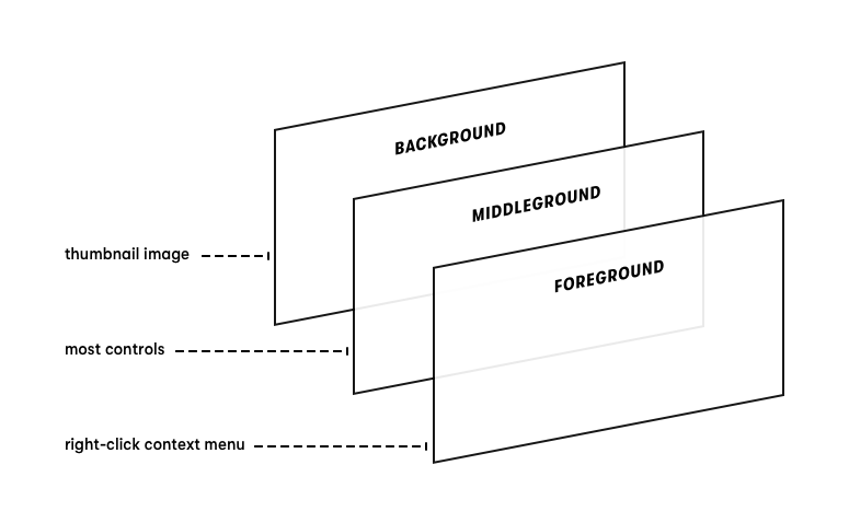
Most controls live in special areas of the middleground. They are segmented so that they can easily coexist without causing unwanted overlaps.
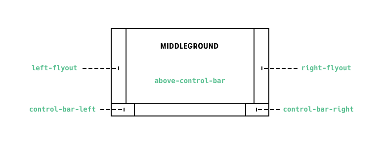
control-bar-left
Control bar buttons that render to the left of the playbar. These also respect the width property set on control's class. The only button that appears to the left by default is the SmallPlayButtonControl, which has a special width of 50. Controls in this region are sorted left to right by their sortValue.
control-bar-right
Control bar buttons that render to the right of the playbar. These also respect the width property set on a control's class, although they are all 40x34 by default. The only current exception is the Wistia logo, which is 120px wide. Controls in this region are sorted left to right by their sortValue.
background
This type is a region that covers the entire video, but any elements in it will naturally appear underneath the controls. So for example, the big play button or control bar will be overlaid on top of any controls that render here. The ThumbnailControl is a notable for using this type.
foreground
This type is a region that covers the entire video, but any elements in it will naturally appear above the controls. So for example, any elements in this region will be overlaid on top of the the big play button or control bar. The ContextMenuControl and ReportAProblemControl use this type.
above-control-bar
This type is a region that covers the middle of the video, but does not extend below the top of the control bar. In most cases, "middle of the video" refers to the entire width of video, except when left-flyout or right-flyout have content. The BigPlayButtonControl, LoadingIndicatorControl, and Subtitles appear here, and are able to center themselves with simple CSS without being aware of any other controls. They are not complete yet, but Annotations will also likely appear in this region; though they will be anchored to the upper right instead of the center.
right-flyout
This type is a region that protrudes from the right side of the video, but does not extend below the top of the control bar. As it expands, it takes space from above-control-bar. The ChaptersFlyoutControl lives here.
left-flyout
This type is similar to right-flyout, except it protrudes from the left side of the video. No controls currently use this region, but it is reserved for future use and is implemented in the interest of symmetry.
Special Methods and Properties
As referenced earlier in this document, there are various special method and property names in the player controls framework. Here we will list them.
Control Class Functions
shouldMount(video)
If this function returns a truthy value, the control will be initialized and mounted. If not defined, it is assumed that the control should always mount.
Control Class Properties
handle
All controls must define a handle property on the class itself; we use this as a key to the control internally, and it is responsible for making the control instance available at video.controls[handle], or in this instance video.controls.backTenSeconds. When multiple controls interoperate, it is useful to be able to refer to them by this handle. For convenience, we also define data-name="[[handle]]" for each control in the DOM, so that the roots are easy to find with CMD+F when debugging.
type
All controls must define their type. There are a fixed number of preset types, and these determine where and how the controls will render. Available types are defined later in this document.
isVideoChrome
The isVideoChrome property defines whether a control should be disabled when the chromeless embed option is set.
If not defined, all controls with type control-bar-left or control-bar-right will set this to true.
Sometimes a control outside of the control bar should also be considered part of the video chrome, like the chapters flyout. If your control satisfies that rare case, you'll want to set ControlClass.isVideoChrome = true.
sortValue
The sortValue property is a generic way of defining the order or priority of controls. For the control bar buttons, it's straightforward: we render left to right. But it can also apply to other types. For example, if only one control can render at a time (like in the right-flyout type), perhaps only the one with the lowest sortValue renders, or their z-index could reflect the sortValue. This will be specified in the documentation for each control type.
width
Control bar buttons are 40px wide by default at 640px wide. Setting this property allows you to change a button's width. For example, the small play button is an exception at 50px wide.
Control Instance Methods
mount(controlRoot)
After a control is initialized, the framework allocates a place for it in the DOM, then calls this method. controlRoot is the DOM element where the control should render.
mountButton(buttonRoot)
Meaningful only in control-bar-left and control-bar-right control types.
If defined, the framework will mount a blank button and give you a reference to buttonRoot, where it's expected that you render an icon. The blank button automatically handles button focus and basic styles.
The presence of this method is required for many other button-centric methods to be defined.
mountDialog(dialogRoot)
Meaningful only for control-bar-left and control-bar-right control types. Requires the mountButton(buttonRoot) method to be defined.
If defined, clicking the button will create a "dialog," which is a transparent overlay locked to the position of the button. After it's created, mountDialog(dialogRoot) is called to allow you to add content to the dialog.
onControlPropsUpdated(prevProps)
The primary lifecycle handler for the player controls framework. It runs whenever anything about control positioning or state changes. For example, if the video is resized, the scale of the controls may change, which may affect props like left, top, and width of many controls. Although you can technically write to this.props, we do not encourage it; it will be overwritten the next time onControlPropsUpdated runs and may be defined an immutable object in the future.
destroy()
If defined, this will be called when a control is destroyed. A control may be destroyed when the video is removed or replaced; when the video's UI is rebuilt; or when a control is enabled or disabled.
It's expected that you clean up any bindings or state here that may cause unexpected behavior or memory leaks if unhandled.
onClickButton(event)
Meaningful only for control-bar-left and control-bar-right control types. Requires the mountButton(buttonRoot) method to be defined.
Runs when the viewer clicks, taps, or activates the button via keyboard. This is provided for convenience: on mobile, it is highly responsive without being overly sensitive.
setButtonLabel(label)
Meaningful only for control-bar-left and control-bar-right control types. Requires the mountButton(buttonRoot) method to be defined.
When using mountButton(buttonRoot), the <button> element is created and managed outside the realm of your plugin, so doing a simple this.buttonElement.setAttribute('title', 'The Title') would not persist.
Use this method to set a persistent label for the button. It affects both the title and aria-label attributes of the <button>.
controlDialogWillOpen()
Meaningful only for control-bar-left and control-bar-right control types. Requires the mountButton(buttonRoot) and mountDialog(dialogRoot) methods to be defined.
This lifecycle method runs when a control's dialog starts to open but before it displays.
controlDialogOpened()
Meaningful only for control-bar-left and control-bar-right control types. Requires the mountButton(buttonRoot) and mountDialog(dialogRoot) methods to be defined.
This lifecycle method runs when a control's dialog has finished animating to its open state.
controlDialogWillClose()
Meaningful only for control-bar-left and control-bar-right control types. Requires the mountButton(buttonRoot) and mountDialog(dialogRoot) methods to be defined.
This lifecycle method runs when a control's dialog starts to close but before it animates.
controlDialogClosed()
Meaningful only for control-bar-left and control-bar-right control types. Requires the mountButton(buttonRoot) and mountDialog(dialogRoot) methods to be defined.
This lifecycle method runs when a control's dialog has finished animating to its closed state.
Control Instance Properties
buttonElement (DOM Node)
Exists only for control-bar-left and control-bar-right control types. Requires the mountButton(buttonRoot) method to be defined.
A reference to the DOM node that encapsulates where the button is mounted. You may want to use this to change or check focus. Note that it is managed and changed outside the realm of your control, so direct changes you make to its html properties will not stick around. If you want to set the label, refer to the setButtonLabel(label) method.
mounted (Promise)
Immediately after a control is initialized--that is, called like new MyControl(video)--it is assigned a mounted property. If the control's mount method (or mountButton method if it's defined) returns a Promise, the mounted property is resolved at the same time. Otherwise, it resolves immediately.
Use this if you wish to perform an action on a control that is only valid once it is mounted. For example:
class MyControl {
  constructor (video) {
    // this.mounted is undefined at this point
  }

  mount (rootElem) {
    // this.mounted is defined but unresolved here
    return new Promise((resolve) => {
      this.rootElem = rootElem;
      // this.mounted will resolve in 100ms.
      setTimeout(resolve, 100);
    });
  }

  changeText (text) {
    this.mounted.then(() => {
      this.rootElem.innerHTML = text;
    });
  }
}
props (Object)
Props vary by a control's type, but these are shared by all:
- chromeless
- controlBarHeight
- controlsAreVisible
- playerLanguage
- scale
- videoHeight
- videoWidth
These values are provided because either (a) they are expensive to calculate repeatedly, or (b) they are hard to derive and may change in the future. They also tend to be useful when positioning or sizing your controls.
Note that the scale value matches the scaling of the control bar. You may define your own scaling formula if you wish. The big play button, for example, scales based on the videoWidth prop.
Controls with a type of control-bar-left or control-bar-right also have these:
- width
- height
- left
- top
The left and top values are relative to the document's origin, so can be compared directly against, for example, pageX and pageY properties from a mousemove event.
Player API Methods for Controls
Forcing controls to remain visible
Sometimes you want your control to prevent the control bar from hiding, even when the viewer is no longer hovering over the video. For example, a slider that is being dragged or a menu opened with the keyboard may wish to keep the controls visible. The methods below allow you to do that without needing to consider the default control functionality.
video.requestControls(requesterName)
This will register that the string requesterName would like the controls to be visible. It will immediately show the controls, as long as that is possible.
video.releaseControls(requesterName)
When requesterName doesn't require the controls to be visible any longer, it can "release" them. Releasing the controls returns them to their normal behavior.
Modifying the input context
The video can be controlled with the keyboard in different contexts. For example, when mousing over the video, spacebar toggles play/pause and the left/right arrows operate the playbar. But when the volume button is focused, the spacebar toggles mute. This change in behavior is accomplished by modifying the input context.
video.enterInputContext('a-string-representing-the-context')
Pushes 'a-string-representing-the-context' to the top of the input context stack. Calling video.getInputContext() after this will return 'a-string-representing-the-context'.
video.exitInputContext('a-string-representing-the-context')
Removes 'a-string-representing-the-context' from the input context stack. Calling video.getInputContext() after this will return the last input context that has not been exited.
video.getInputContext()
Returns the current input context as a string, or a falsey value if there is no input context.
Input Context Example
Below is an example of a focusable control which will log "tapped spacebar in MyControl" only when it is focused and the spacebar is tapped.
class MyControl {
  constructor (video) {
    this.video = video;
    document.addEventListener('keyup', this.onKeyUp, false);
  }

  mount (rootElem) {
    rootElem.setAttribute('tabindex', 0);
    rootElem.addEventListener('focus', this.onFocus);
    rootElem.addEventListener('blur', this.onBlur);
  }

  destroy () {
    document.removeEventListener('keyup', this.onKeyUp, false);
  }

  onKeyUp = (event) => {
    if (this.video.getInputContext() !== 'my-control') {
      return;
    }

    if (event.keyCode === 32) {
      console.log('tapped spacebar in MyControl');
    }
  }

  onFocus = () => {
    this.video.enterInputContext('my-control');
  }

  onBlur = () => {
    this.video.exitInputContext('my-control');
  }
}
Disable or enable a control
Disable a control with handle myHandle:
video.setControlEnabled('myHandle', false)
Enable a control with handle myHandle:
video.setControlEnabled('myHandle', true)
Note that an enabled control will only appear if its shouldMount function returns a truthy value, or if shouldMount is not defined.
whenControlMounted(controlName)
Returns a Promise that resolves when the given control has been mounted. This may be useful if you're writing code that's dependent on the existence of a given control.
More Example Controls
A Control Bar Button with a Dialog
class MyButtonWithLinksControl {
  mountButton (buttonRoot) {
    buttonRoot.innerHTML = 'links';
    this.dialog.open();
  }

  mountDialog (dialogRoot) {
    dialogRoot.innerHTML = `
      <ul>
        <li><a href="https://wistia.com" target="_blank">Wistia!</a></li>
        <li><a href="https://trello.com" target="_blank">Trello!</a></li>
        <li><a href="https://mailchimp.com" target="_blank">MailChimp!</a></li>
      </ul>
    `;
  }
}

MyButtonWithLinksControl.handle = 'myButtonWithLinks';
MyButtonWithLinksControl.type = 'control-bar-right';
MyButtonWithLinksControl.sortValue = 500;

Wistia.defineControl(MyButtonWithLinksControl);
Of note here is the mountDialog method, which is a "magic" method in that
control bar buttons look for its presence. If it exists, this.dialog will be
assigned to the control instance, and clicking the button will toggle the
visibility of the "dialog," which is a semi-transparent overlay that appears
above the control. This particular example opens the dialog immediately, so it
will appear already opened when the player renders. The mountDialog method
will run the first time a dialog is opened.
This logic is provided as a helper because coordinating and positioning dialogs
is moderately complex, and it is behavior that's shared by many controls.
Available methods on this.dialog are:
open()close()isOpen()hasOpened()
A Control that is not in the Control Bar
class BottomLeftWaterMarkControl {
  mount (rootElem) {
    this.watermark = document.createElement('img');
    this.watermark.src = 'a-totally-real-src.jpg';
    this.watermark.style.opacity = 0.5;
    this.watermark.style.transition = 'opacity 400ms, transform 400ms';
    this.watermark.style.transform = `scale(${this.props.scale})`;
    this.watermark.style.position = 'absolute';
    this.watermark.style.left = `${10 * this.props.scale}px`;
    this.watermark.style.bottom = `${10 * this.props.scale}px`;
    rootElem.appendChild(this.watermark);
    const imgLoadPromise = new Promise((resolve) => {
      this.watermark.onload = resolve;
      this.watermark.onerror = resolve;
    });
    const oneSecondPromise = new Promise((resolve) => {
      setTimeout(resolve, 1000);
    });
    return Promise.race([imgLoadPromise, oneSecondPromise]);
  }

  onControlPropsUpdated (prevProps) {
    if (this.props.scale !== prevProps.scale) {
      this.watermark.style.transform = `scale(${this.props.scale})`;
    }

    if (this.props.areControlsVisible !== prevProps.areControlsVisible) {
      this.watermark.style.opacity = this.opacityBasedOnControlVisibility();
    }
  }

  opacityBasedOnControlVisibility () {
    if (this.props.areControlsVisible) {
      return 0.5;
    } else {
      return 0.2;
    }
  }
}

BottomLeftWaterMark.handle = 'bottomLeftWaterMark';
BottomLeftWaterMark.type = 'above-control-bar';

Wistia.defineControl(BottomLeftWaterMarkControl);
The above example defines a watermark that appears in the lower left corner of
the video, but above where the controls appear. It becomes more opaque when
the controls are visible, and it scales its size responsively along with the
player controls.
Of note here, instead of using mountButton or mountDialog like the control
bar buttons, we use the more generic mount, which provides no special helpers
or functionality; it just gives a place to render html. The mount method is
available to all controls, although control bar buttons typically don't use it.
Interestingly, we return a Promise from the mount function. In this case, the
Promise will resolve when the image loads (or fails) or when 1 second has
passed. By returning a Promise, the control is saying "the mount function of
this control is asynchronous." The player UI knows how to interpret this, and
will delay the rendering of the video and controls until all control Promises
have resolved. The ThumbnailControl returns a Promise, as does the
ChapterFlyoutControl, since it fetches the WistiaOverpass font asynchronously
on load and we try to avoid a visible font change. It is good practice to
use Promise.race(...) to set a maximum initialization time--otherwise, a
single control that never resolves can block the video from rendering.
We've also defined onControlPropsUpdated, which is the primary lifecycle
handler for the player controls framework. It runs whenever anything about
control positioning or state changes. For example, if the video is resized,
the scale of the controls may change, which may affect props like left,
top, and width of many controls. Although you can technically write to
this.props, we do not encourage it; it will be overwritten the next time
onControlPropsUpdated runs and may be defined an immutable object in the
future.
Dependent Controls
Sometimes one control is dependent on another for its functionality. For example, the ChaptersButtonControl isn't very useful unless the ChaptersFlyoutControl is also mounted.
If controls need to interoperate, it's expected that they reference each other via video.getControl("theHandle").
class MyButton {
  constructor (video) {
    this.video = video;
  }

  mountButton (buttonRoot) {
    buttonRoot.innerHTML = 'toggle';
  }

  onClickButton (event) {
    this.video.getControl("myOverlay").toggle();
  }
}

MyButton.type = 'control-bar-right';
MyButton.handle = 'myButton';
W.defineControl(MyButton);

class MyOverlay {
  constructor (video) {
    this.video = video;
    this._isOpen = false;
  }

  mount (rootElem) {
    const overlay = overlay = document.createElement('div');
    overlay.innerHTML = 'hi';
    overlay.style.display = 'block';
    overlay.style.position = 'absolute';
    overlay.style.top = 0;
    overlay.style.left = 0;
    overlay.style.width = '100%';
    overlay.style.height = '100%';
    overlay.style.background = 'rgba(255, 0, 0, 0.5)';
    overlay.style.color = '#fff';
    rootElem.appendChild(overlay);

    if (video._opts.asyncOverlay) {
      return new Promise((resolve) => {
        setTimeout(2000, () => {
          this.overlay = overlay;
        });
      });
    } else {
      this.overlay = overlay;
    }
  }

  isOpen () {
    return this._isOpen;
  }

  open () {
    this._isOpen = true;
    this.overlay.style.display = 'block';
  }

  close () {
    this._isOpen = false;
    this.overlay.style.display = 'none';
  }

  toggle () {
    if (this.isOpen()) {
      this.close();
    } else {
      this.open();
    }
  }
}

MyOverlay.type = 'foreground';
MyOverlay.handle = 'myOverlay';
W.defineControl(MyOverlay);
For controls that mount synchronously, this will work perfectly. However, we
should note that, although controls are guaranteed to be initialized
synchronously--that is, you can always reference another enabled control via
video.controls after the constructor runs--not all controls are guaranteed to
be mounted at the same time.
So if the video above had set the (totally fabricated) asyncOverlay embed
option, the MyOverlay control would have mounted asynchronously. And clicking
the button within the first 2 seconds after load would have resulted in an
error because this.overlay is not defined.
To deal with this, we also set the mounted property for each control, which
is Promise that resolves when the control has been mounted. Therefore, to fix
MyOverlay so it works even when it's mounted asynchronously, you could modify
the toggle method like so:
  toggle () {
    this.mounted.then(() => {
      if (this.isOpen()) {
        this.close();
      } else {
        this.open();
      }
    });
  }
Browser Support Considerations
The framework described here only applies to the Vulcan V2 player, which is delivered by default for all modern browsers and IE11. It uses the class syntax, which is not supported in IE11. If you need to support IE11, transpiling your classes should work just fine.
If you are not transpiling javascript and need IE11 support, you can use the old function/prototype syntax:
function MyControl (video) {
  this.video = video;
  return this;
}

MyControl.prototype.mount = function (rootElem) {
  this.rootElem = rootElem;
};

MyControl.prototype.onControlPropsUpdated = function (prevProps) {
  // ...
};

// etc.
Working with iframe embeds
When working with iframe embed codes, an extra step is needed to bridge the gap between the Wistia player and the Player API by following these steps:
- Define the new control and save it as a JavaScript plugin, e.g. my-plugin.js
- Load the plugin on a webpage via the Player API
- Toggle the control on/off with parameters on the iframe URL, or adjust the control definition from Step 1 to always be on when the plugin is loaded.
Note
For Step 1, refer to the BackTenSecondsControl example in the Basic Control Definition.
A plugin can be added to a webpage via the Player API to make it available for embedded videos:
//iframe embed code
<iframe src="https://fast.wistia.net/embed/iframe/abcde12345?backTenSecondsControl=true" title="Video" allow="autoplay; fullscreen" allowtransparency="true" frameborder="0" scrolling="no" class="wistia_embed" name="wistia_embed" allowfullscreen msallowfullscreen width="640" height="360"></iframe>
<script src="https://fast.wistia.net/assets/external/E-v1.js" async></script>

//player API script to load the plugin
<script>
window._wq = window._wq || [];
window._wq.push({
  id: "ku2z98ax51",
  onFind: function(video) {
    video.addPlugin("myPluginName", {
      src: "https://wiggly-tree-nectarine.glitch.me/my-plugin.js"
    });
  }
});
</script>
In this example, the control is enabled on the iframe embed with the parameter ?backTenSecondsControl=true.
The control on/off toggle is defined in the plugin definition from Step 1. The plugin can be modified to always be enabled when loaded on a page with embeds by removing this code from the definition:
//Remove these lines to always enable the control when the plugin is loaded
 BackTenSecondsControl.shouldMount = (video) => {
      return video._opts.backTenSecondsControl === true;
    };
Updated 5 months ago